
Peter C. Papademetriou


Published Writings 7 - as referred to by *
HOUSTON an architectural guide
With Perspecta 12 and the Lou Kahn book behind me, I was approached to produce the 1972 AIA Convention Guidebook.
The "Senior" AIA/Houston Chapter Publication Board Members remembered when Frank Lloyd Wright received the 1948 AIA Gold Medal at the Shamrock Hilton Hotel (see Published Works 6 TEXAS ARCHITECT - Nov-Dec 1979 cover; "CLICK" to Link), when they were the then "Young Guard". They wished to memorialize work by Houston Architects, especially their own Firms, whereas I (and the "new Young Guard" Members of the Committee) wanted to show the range of buildings in the City, "As It Really Was", regardless of who might be a 'designer'. Quite an 'interesting' experience . . . [see Letters below]


The Guide ultimately challanged assumptions about:
Architecture/Power/Symbolism.
(Also see Published Works 12 [The Museums of Fine Arts, Houston "CLICK" to Link]) regarding the politics of the design and production of the Guide, as nay-sayers did not believe the vision would be realized in time . . . so I agreed to make the Gift to AIA Attendees the same size.
While the Guide was WHITE and RED, the MFA,H book was BLACK and SILVER.
'CLICK' on images for Caption and to review in Sequence.

Combining a NASA aerial with USGS maps, creating a to-scale replication using 'words' to suggest the Urban Context.
Pre-Convention issue, for which HOUSTON an architectural guide was to be put before all AIA Members.
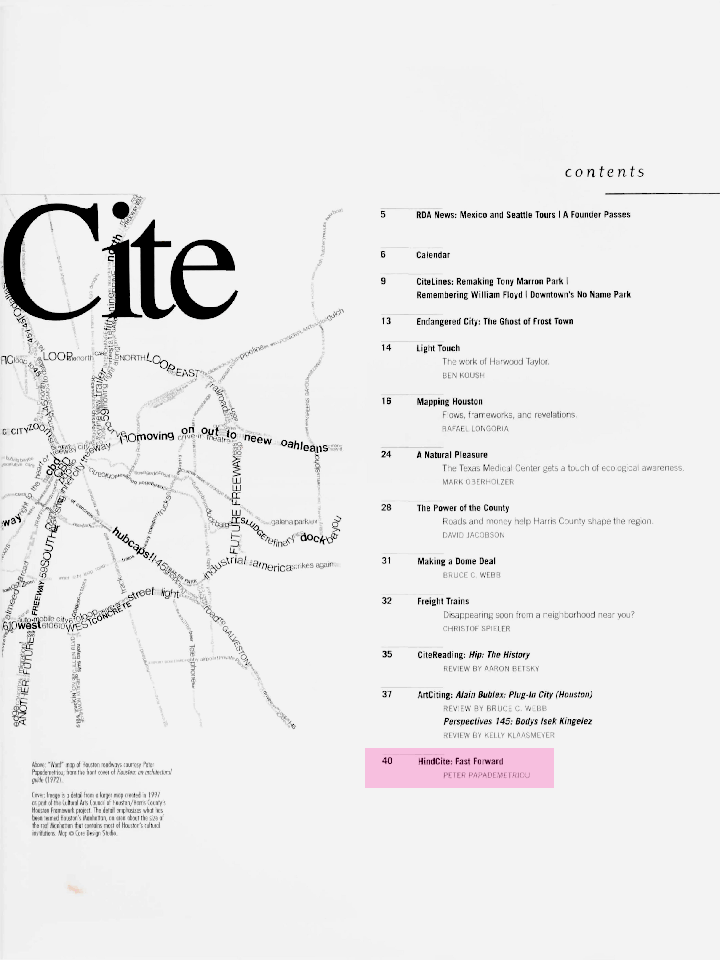
Table of Contents: "HIND CITE: Fast Forward" article, using the cover of HOUSTON an architectural guide from 1971 as illustration. Read text in PUBLISHED WORKS 6
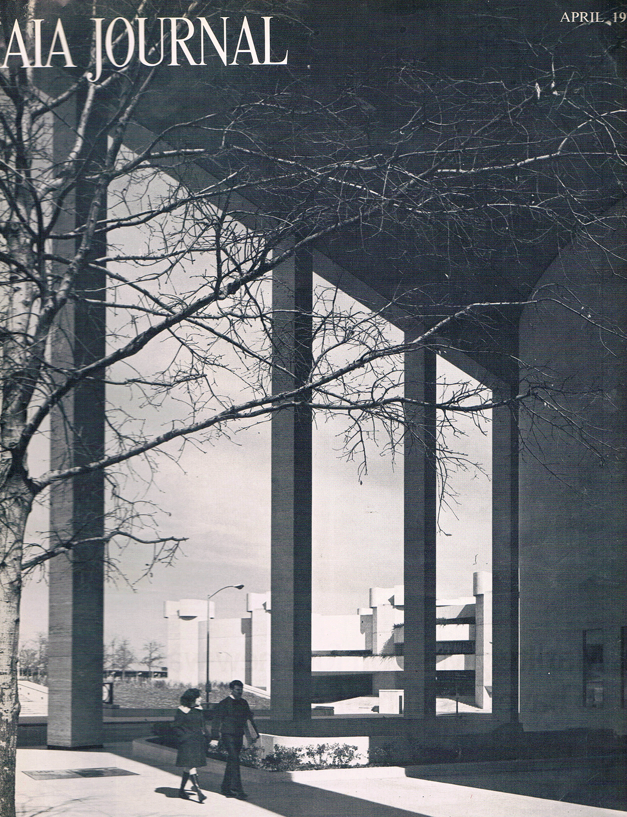
I was asked to write a "Pre-Quel" cover story in the national AIA Journal; in it, I tried to make it clear that Houston was at an important moment in its evolution, but also presented an environmental/historical/social series of challenges to Architects directed to the younger generation who wanted to be relevant in a professional context both serving and questioning their mission not only as "mirrors" of Society, but more so as "beacons" to lead in defining the physical environment.

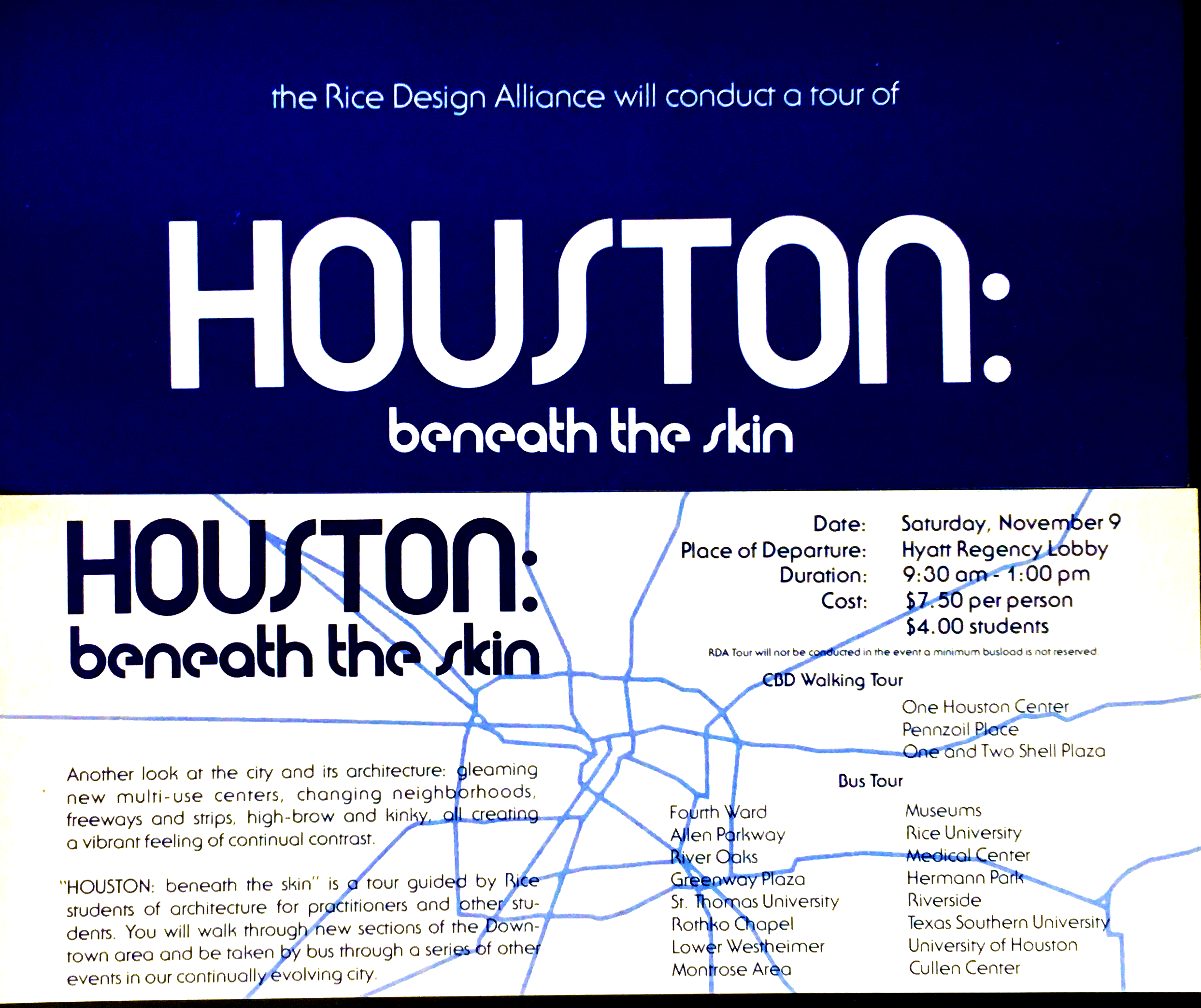
As a result of publication, the Rice Design Alliance created a series of Houston tours led by students, which cited "Another look at the city and its architecture, gleaming multi-use centers, changing neighborhoods, freeways and strips, high-brow and kinky, all creating a feeling of continual contrast".
Having done Houston Guide, and worked with establishing The Houston Architecture Archive, Houston Public Library,
my collection of miniature buildings had been on exhibit and underscored my interest in illustrating Popular Concepts
as shown in 'facsimile'

An lnvitation to Nominate an Individual, Business or Organization for the Ninth Annual Environmental lmprovements Awards Competition, sponsored by The Houston Municipal Art Commission and the Houston Chapter, American Institute of Architects. I was listed as a member of "A distinguished panel of judges . . ." and specifically as Author of HOUSTON an architectural guide.
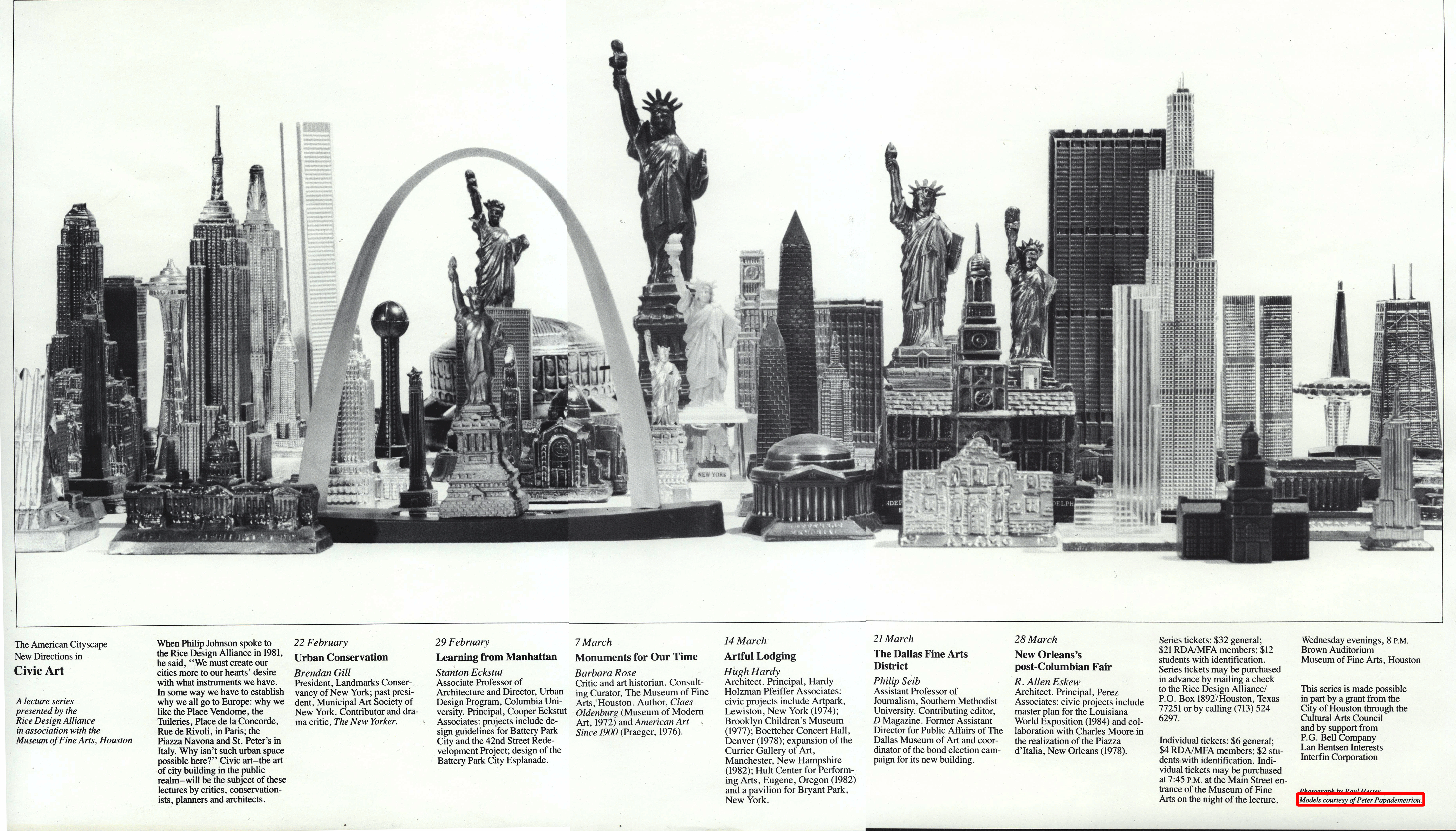
"New Directions in Civic Art", a lecture series by the Rice Design Alliance in association with the Museum of Fine Arts, Houston. The image is from a small part of my collection of miniature buildings.
INTRODUCTION: Design/Production Team; Contents; Acknowledgements; Foreword; Essay; Afterword

Houston at its Beginning: the "Bayou City" and "head of Navigation".

Use of the "wagon wheel" urban form to rationalize the designation of the city's "Areas".
My Foreword touches in detail on the 'gap' of recording the changes in the fabric of the city, all within only two decades since the last AIA Convention in Houston.
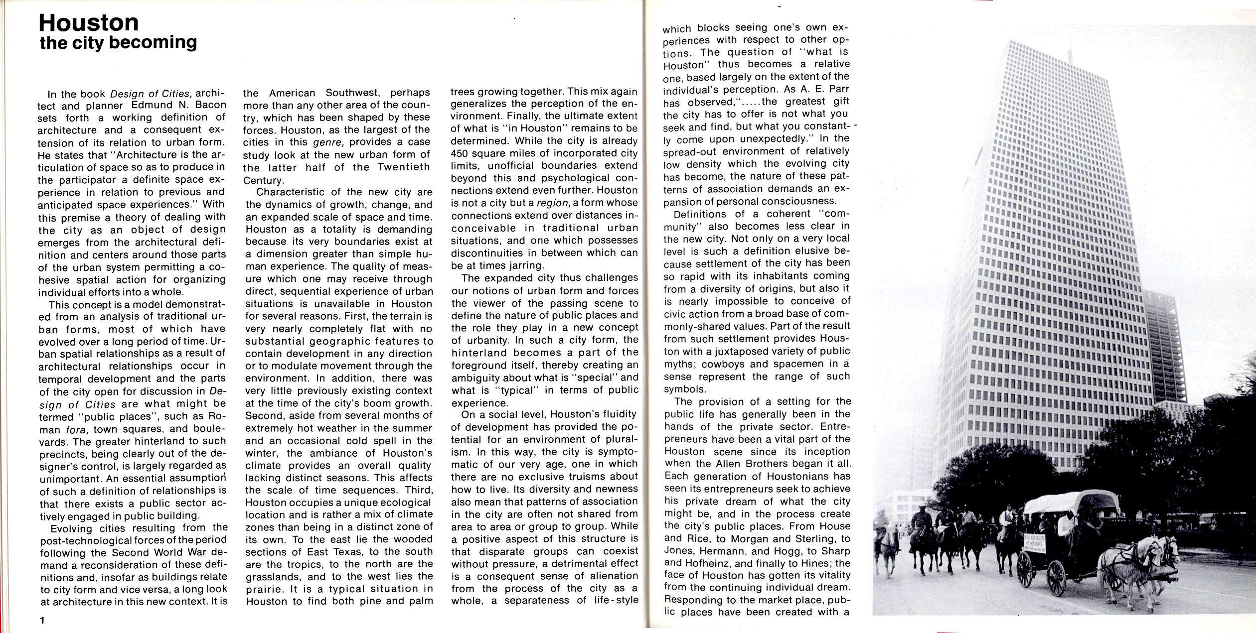
Houston in the '70s: Contrasts such as the annual 'Trail Riders' on horseback with Conestoga Wagons pass the Shell Building by SOM Architects.
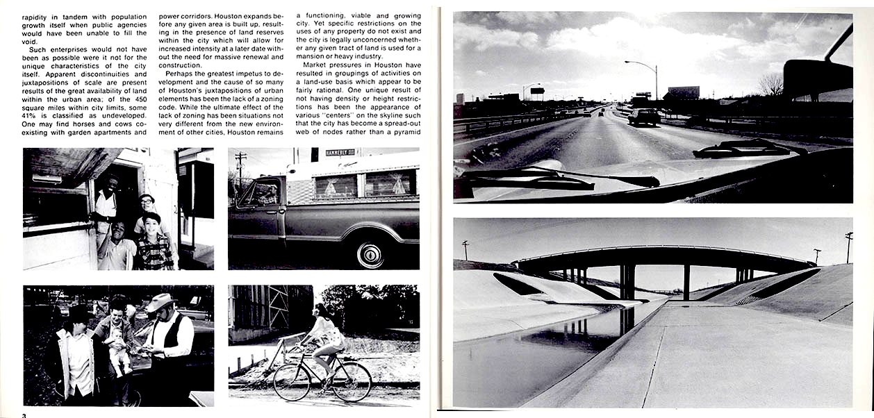
"The View From the Road", funky people & lifestyles, flat terrain & water drainage.
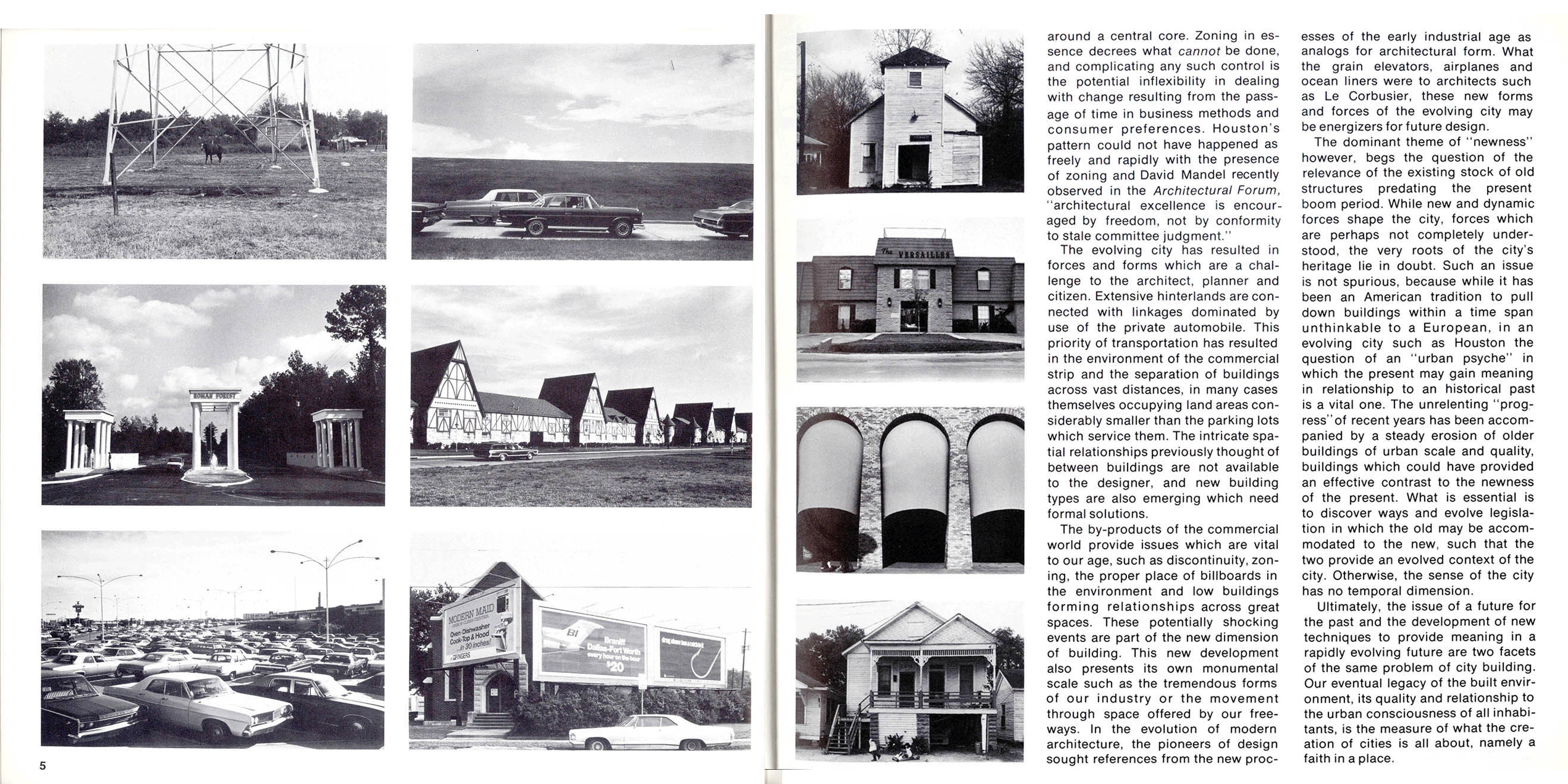
What defines 'urban space', what are the symbols of 'place' in an emerging city?

Great Expectations . . .
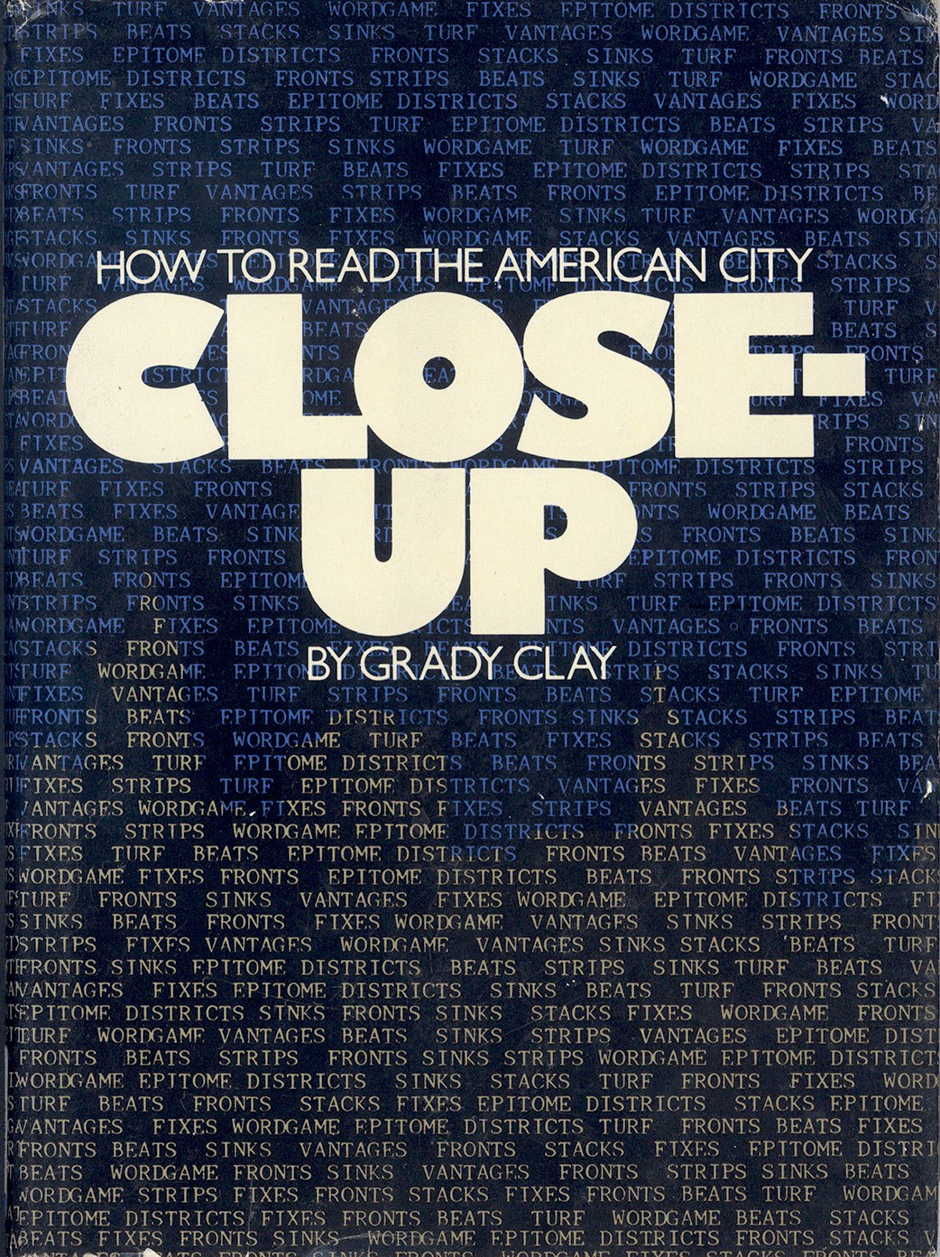
Grady Clay was the Senior Editor for Landscape Architecture; his comments on the Guide are cited by others.
One of the 15 Sections of the Guide is represented in Reproduction, from the map with buildings located, an essay on the Area, photographs chosen to illustrate "reality", and what are now known as "thumbnails" of the building, dates, address and designers.
The Social Strata are reflected in the sequence, based on the geography of the radial/'wagon wheel' form of the City, from center to outlying area.
As such, the more 'funky' Inner-City areas naturally came first; Area EIGHT was interesting, because it included a variety of discreet sub-areas as well as institutions. Therefore, the 'opening' of the narrative prompted one River Oaks Lady to query, "Why did you show 'those people' first?". I replied that "They" were there first, as the site, directly adjacent to what is now 'Downtown' is the Fourth Ward, the original 'Freedmans Town', subsequent to the 19 June 1863 Emancipation Proclamation; 'Freedmans Town' was created in Texas on that date in 1865 (at the end of the Civil War) and celebrated as "June-teenth". The Subdivision of River Oaks, by contrast, wasn't established until the 1920s.
Three Guidebooks compared [in reverse Order]:
The Austin Chapter American Institute of Architects/Women's Architectural League issued a commemorative Bicentennial local city guide, Austin and its Architecture,in 1976, and the 1986 San Antonio Chapter, AIA guide, A Guide to San Antonio Architecture having followed the 1972 HOUSTON an architectural guide [designed for the National AIA Convention].
Struck by certain graphic design, typography Font, and organizational 'similarities', I include a few juxtaposed 'comparisons' for your consideration.
“Imitation is the sincerest form of flattery that mediocrity can pay to greatness.” Oscar Wilde

San Antonio
Austin and Houston
compared . . .
in
size,
shape,
graphic format, and
organization
An important image in HOUSTON an architectural guide [by photographer Bill Lukes] was taken of 2 Tourists at the Astrodome, holding a postcard, and Bill thought the 'picture within a picture' idea was terrific. They had asked for directions to The Galleria,and he said he'd tell them if they posed.
I suppose it was flattery that it appeared as an ad for Building Modern Houston, insenfitively reversed and cropped cutting the irony of the broad, empty parking lot. Bill used a 4x5 format, and was adament to keep the proportions, while most images in my graphic grid were based on 35mm format proportions, but we did it in any event, as a creative exception.


The 'concept' of structuring presentation/organization of a City guide paralleled all Guides; the Houston was based upon the framework of its Roadway armature.

The Austin Guide was the closest in design to its predecessor, HOUSTON

Even a small [but more Historic] "town" used the overview based on similar strategies.

Every city has a 'Downtown', at least historically. A Key map, North arrow, buildings numbered, gave a point of reference.