
Peter C. Papademetriou


PORTFOLIO 1- a House on a Waterway


Requirements
The project is on a secluded one-acre residential lot sited adjacent to a small body of water. The approximate center of the heavily-treed site had a natural clearing at sufficient elevation above the flood plain to locate the residence. A gentle but significant slope cut diagonally across the western to eastern contours.
Of particular interest in the program was an implicit need for flexibility in use and occupation, as the owners, (a married couple), wished to accommodate their grown children, as well as occasional guests, whose tenancy would vary. This specific requirement also allowed for a more generic consideration of the general housing issue of space-use over time in the public areas, as well as an organization which would clearly separate private areas in a classic 'parent/child' zoning.
The owners had a collection of contemporary works of art, as well as nineteenth century glass and early twentieth century photography. They specifically wanted an aesthetic which was "modern", by which they meant minimalist, abstract, and a container for their art and contemporary furniture.They also wanted a sense of privacy on the approach side, but a clear orientation to views and outdoor living on the water view side of the house. There were many specific interior requirements, particularly for storage, as well as features such as a greenhouse designated to be designed for use as aninterior space.
Solution
The complex program requirements were organized as a set of simple oppositions. The basic parti is a classic "binuclear" arrangement into children/service wing and master suite/living wing, connected by a cross circulation as a gallery for part of the owner's art collection. The former wing was rendered as a series of conventional ceiling height spaces, as it contained service elements and occasional occupancy. The latter wing was given more generous spatial dimension, both in planning and cross-section. The binuclear arrangement was also articulated as a "split-level", facilitating the development of the gallery as a vertical connecting "slot".
The essential Z-shape of the building was made to create a contrast between the formality of the entry court, in scale with automobile arrival on the approach side of the house, to the informality and scaled-down irregular massing defining the exterior spaces oriented to the waterfront view.
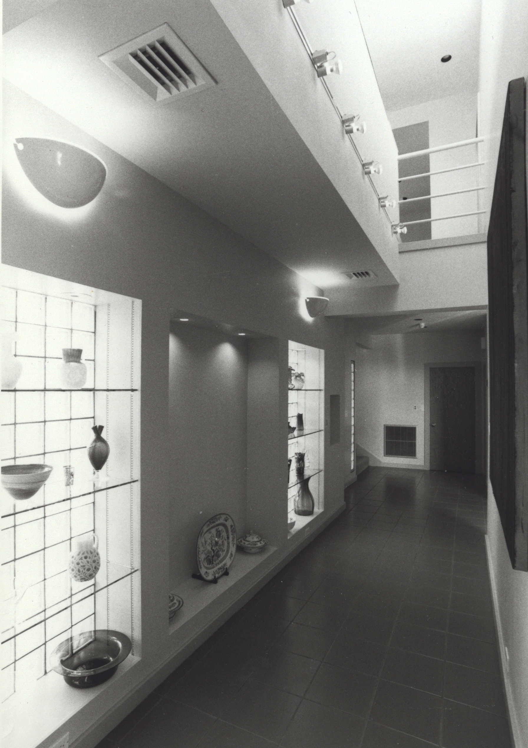
Exterior surface treatment, particularly the approach elevation, exhibits a restrained classicizing treatment, while the private activity side is developed as a diverse range of interior/exterior spatial relationships. The gridding of space, used as an organizing principle, interlocks both sections of the house, derives the regularity of the building mass, and relates the total surface treatment and development of its apertures to the interior spaces. The gallery continues the roofline of the primary wing as a clerestory of the two wings in a complex series of socializing spaces which elaborate the overlapping relationships of the two parts of the plan. Image reflects the client's tastes in an austere aesthetic wherein richness was seen to come from precision of detail, simple lines and proportions, and quality of materials and finish.
I chose to evoke both the volumetric massing seen in the American versions of the International Style of the 1930s, as well as its classicizing tendencies, American Art Deco and trends in recent 'Rationalist' architecture toward purity of form, symmetry and primary formal elements. Exterior color evokes these tendencies, primarily the recollection of Art Deco. On a lyrical level, it alludes to the neighbor (a prominent local Heart Surgeon who always wore his 'scubs'), natural imagery of the waterway by suggesting a "displacement line" in a stripe around the building (jokingly, the 'Hundred Year Flood line'). The division of color into bands also lends a measure of scale to the block and, by suggesting a kind of rustication, establishes a base for the building (suggested to client that the Olive Gray would work with moss growing, due to the humid site). Color was chosen to integrate to the site, and complement the quality of natural light found in the region and climates of coastal areas.
'CLICK' on images for Caption and to review in Sequence.

Orientation respects: - Solar Path - site contours - view
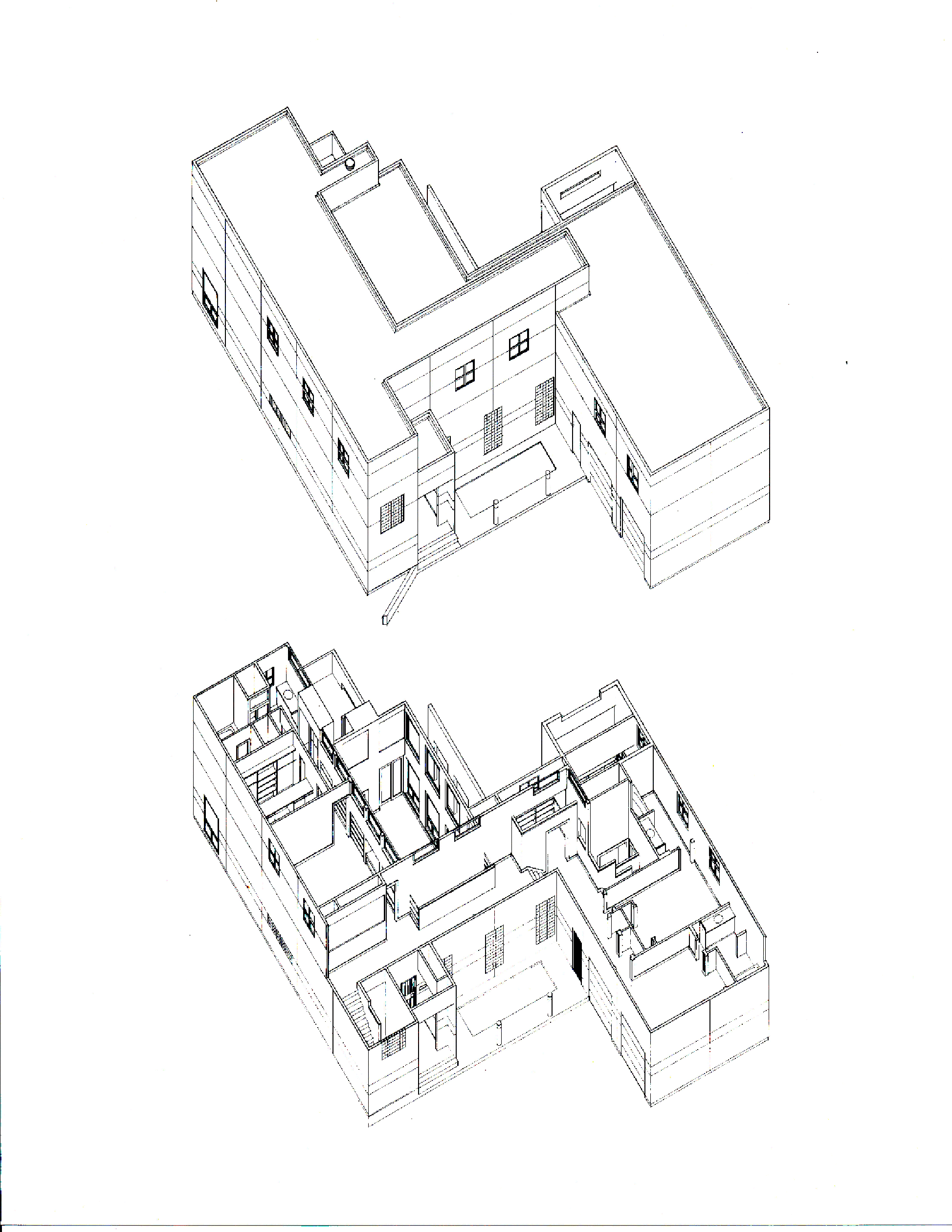
UPPER: exterior massing of approach/Entry Court LOWER: Master Suite L, tall spaces of Living Room & Gallery in Center, "extra"/occasional use bedrooms R
UPPER: "extra" bedrooms and Sun Room tall volume R, Master Suite + its outdoor terrace LOWER: stairs linking both sides L & R, tall volume of Living Room
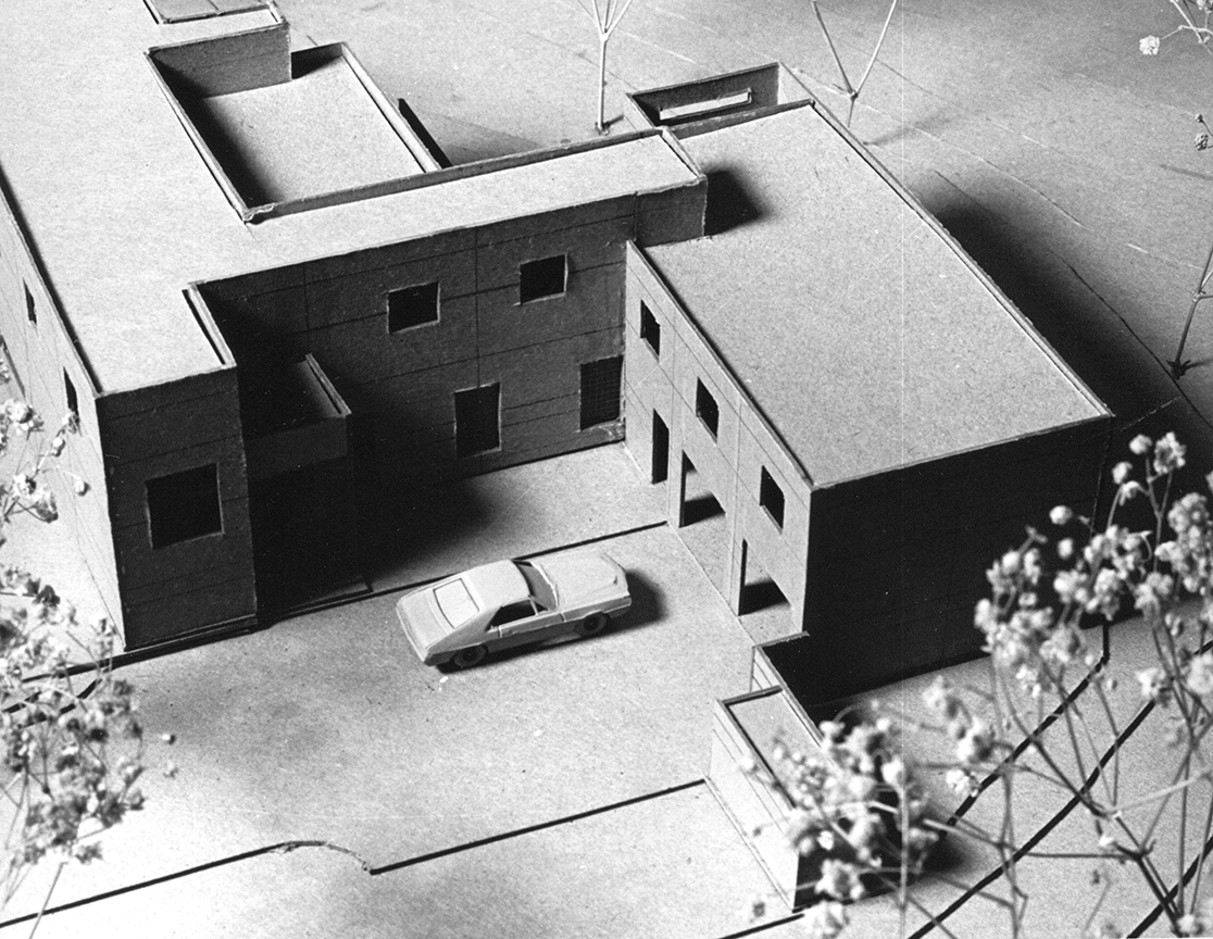
Clients best understand Design by a Physical Model, in this case the Privacy of the Entry Court.
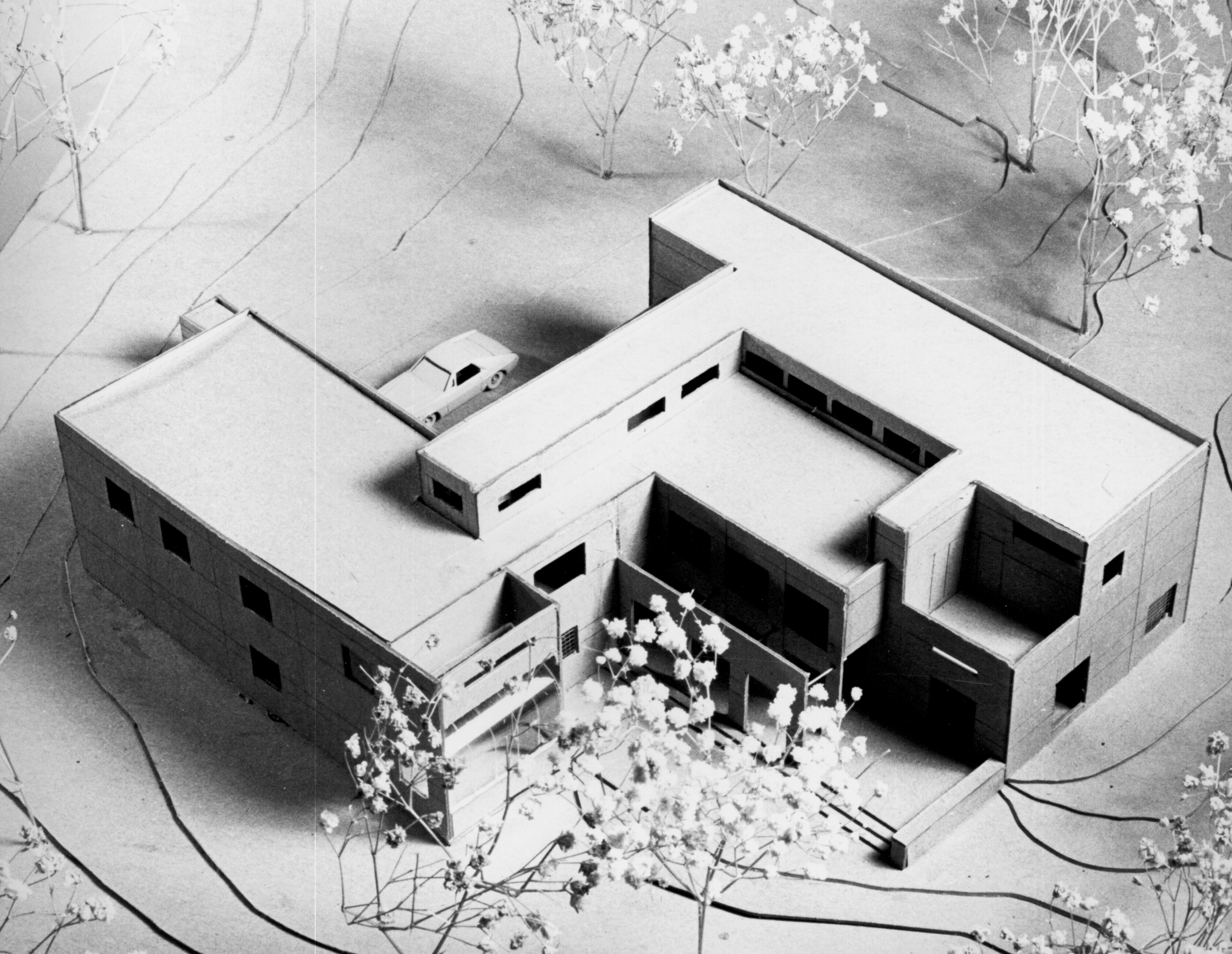
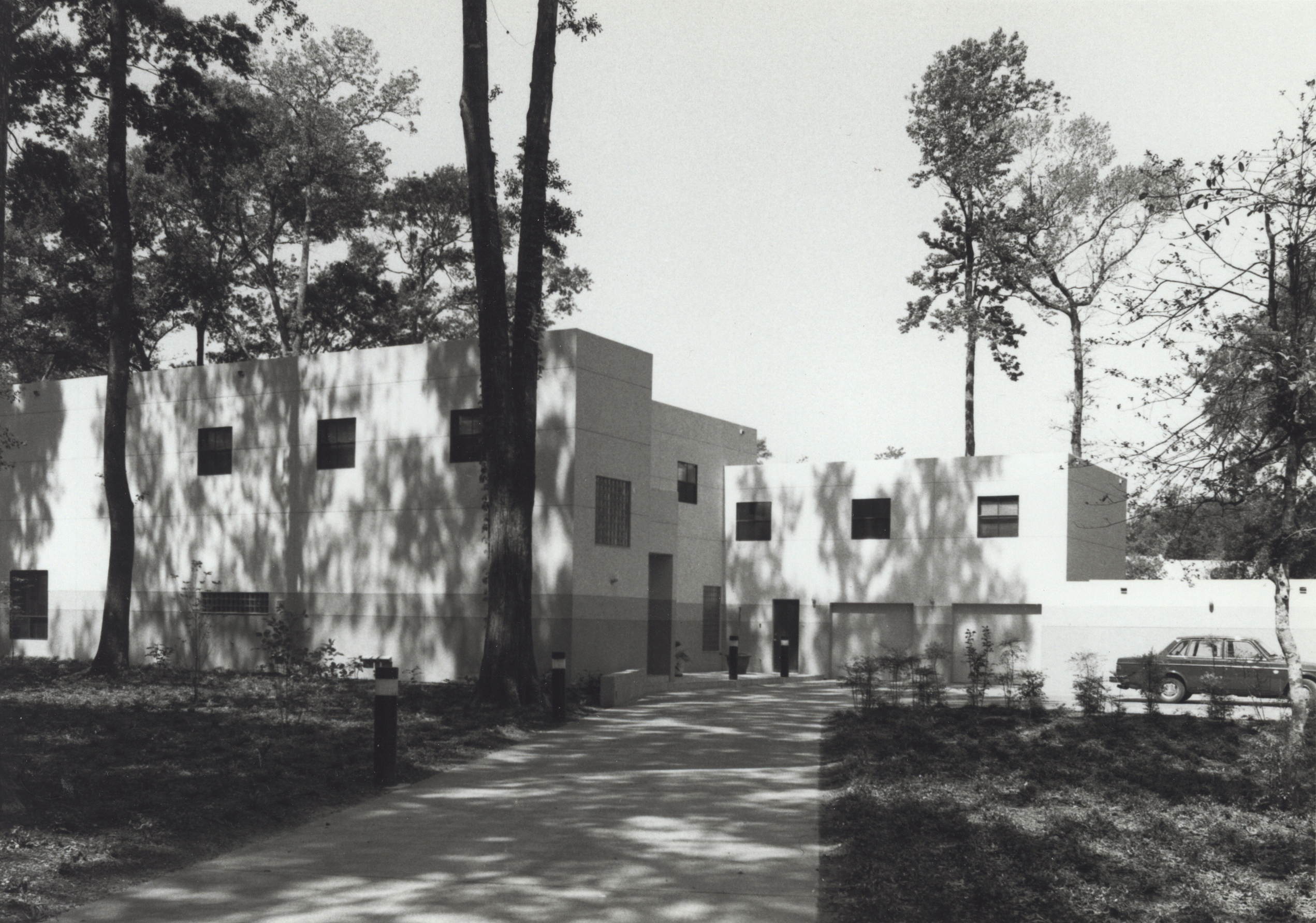
The concept of interlocking 'blocks' and more 'domestic-scaled' massing became clear by seeing the contrast of models.
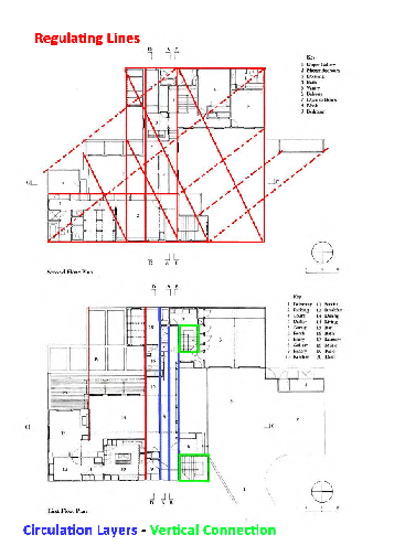
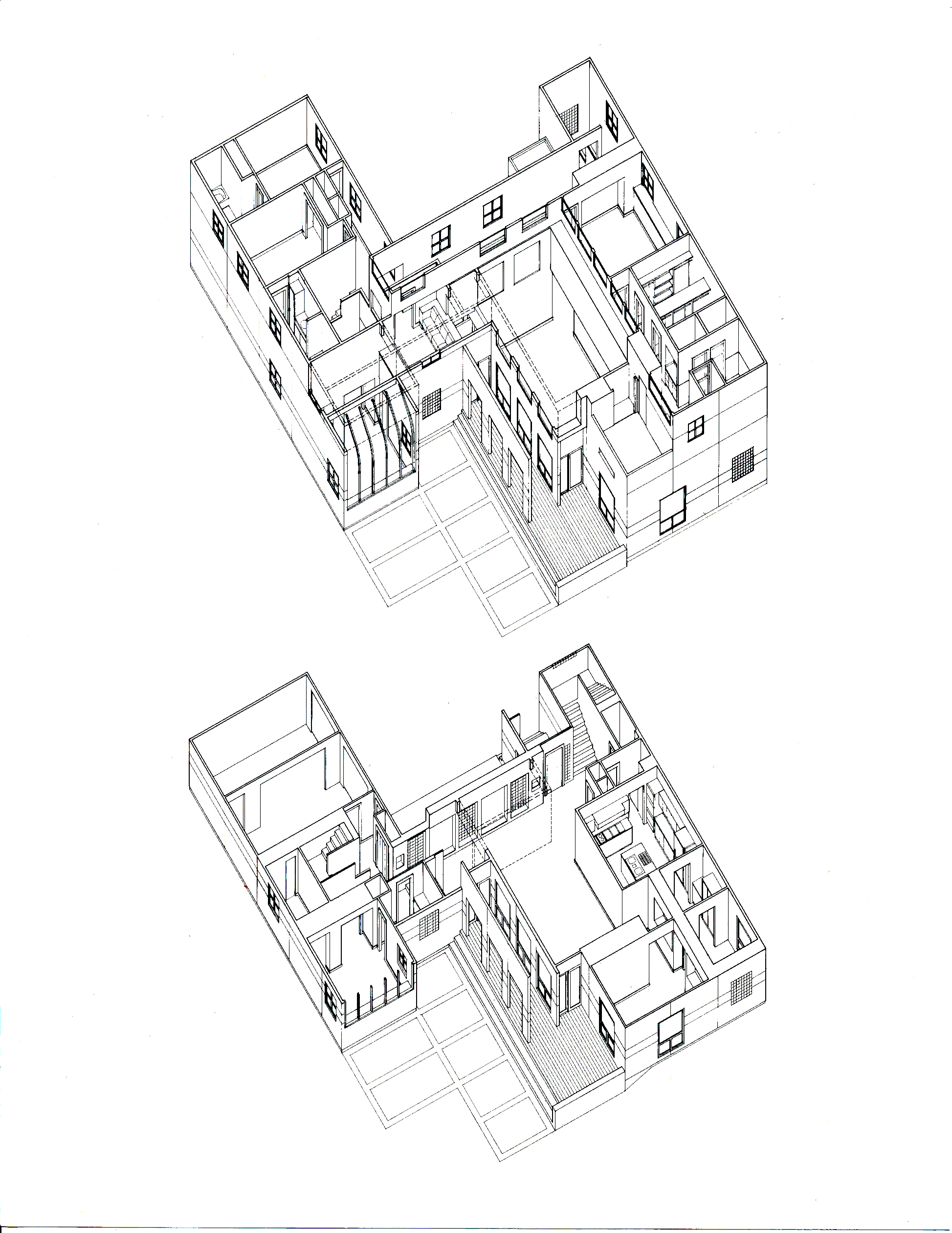
UPPER: Second Floor illustrating Regulating Lines LOWER: First Floor illustrating Spatial 'Layers'
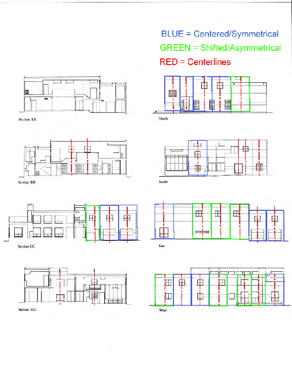
Symmetry and Shifted Symmetry illustrated
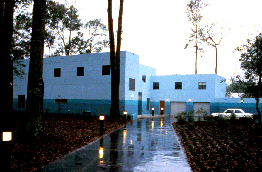
View from street approach, NE
A bright sunny day; not every day in Louisiana!
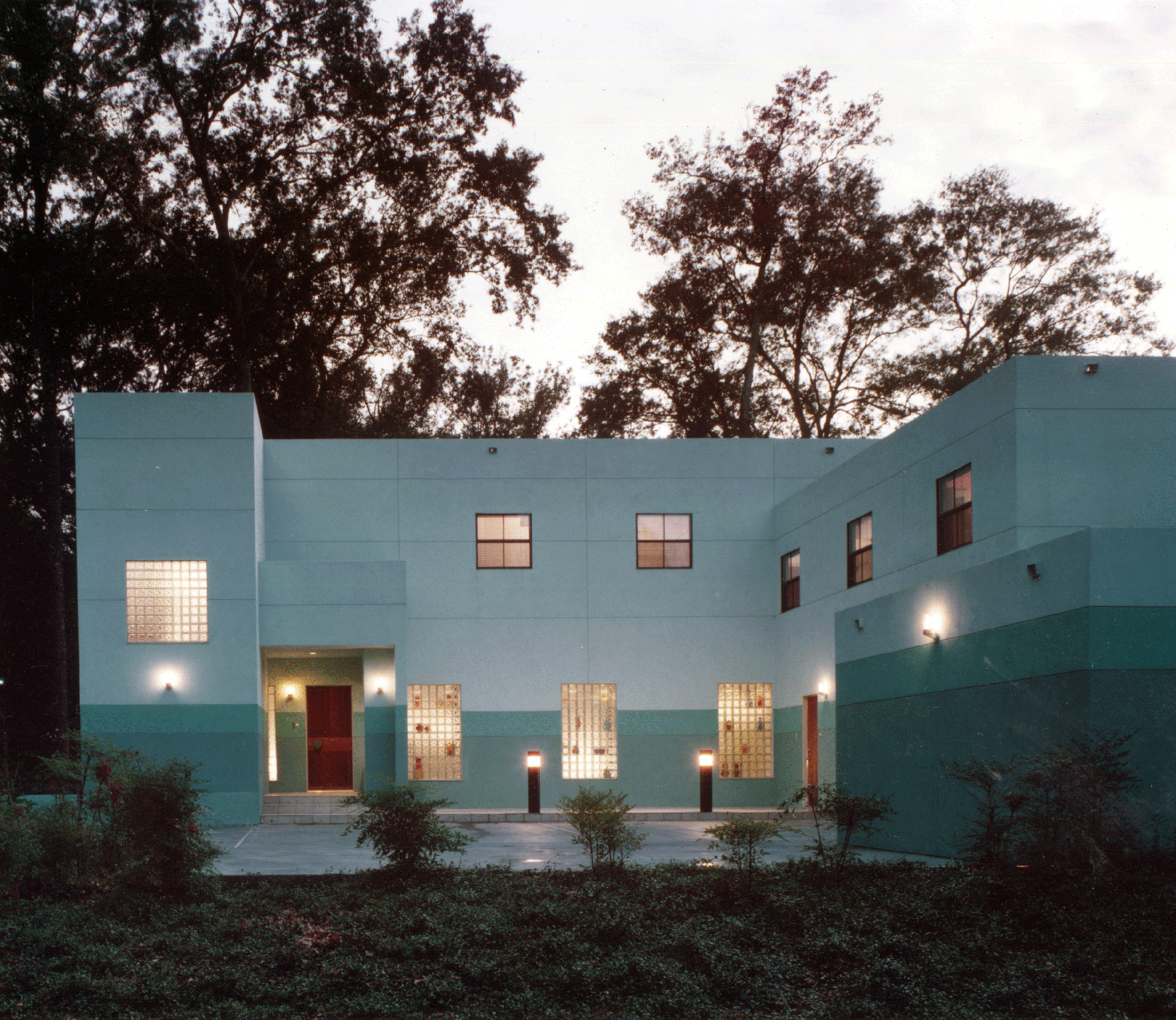
Night view of Entry Court, illustrating both 'monolithic' privacy expression, owner's art glass seen through glass block panels, and contrasting patterns of 2 / 3 apertures, within a symmetrical facade
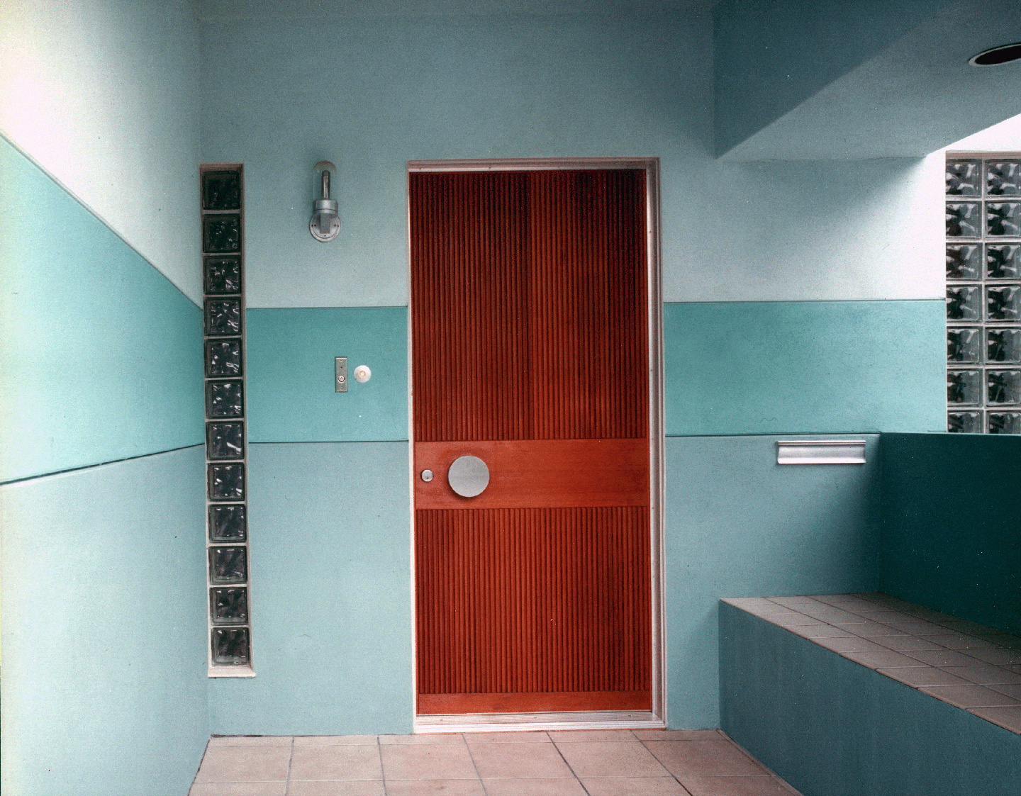
Porch as 'social space', providing bench and protected, covered exterior. Teak door designed to integrate with 'banding' on Elevations.
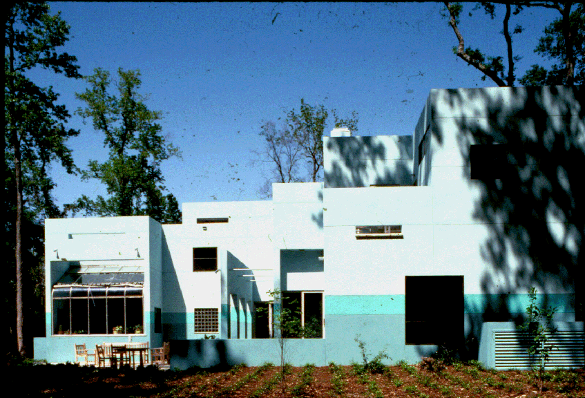
Rear massing contrasts to that of Entry Court: articulation represents activity units, and orientation captures a full day of sunlight.
The Living Room wall (R) has large apertures cut into the wall, but the additional freestanding exterior wall plane both frames views, provides shade and structurally acts as a brace.
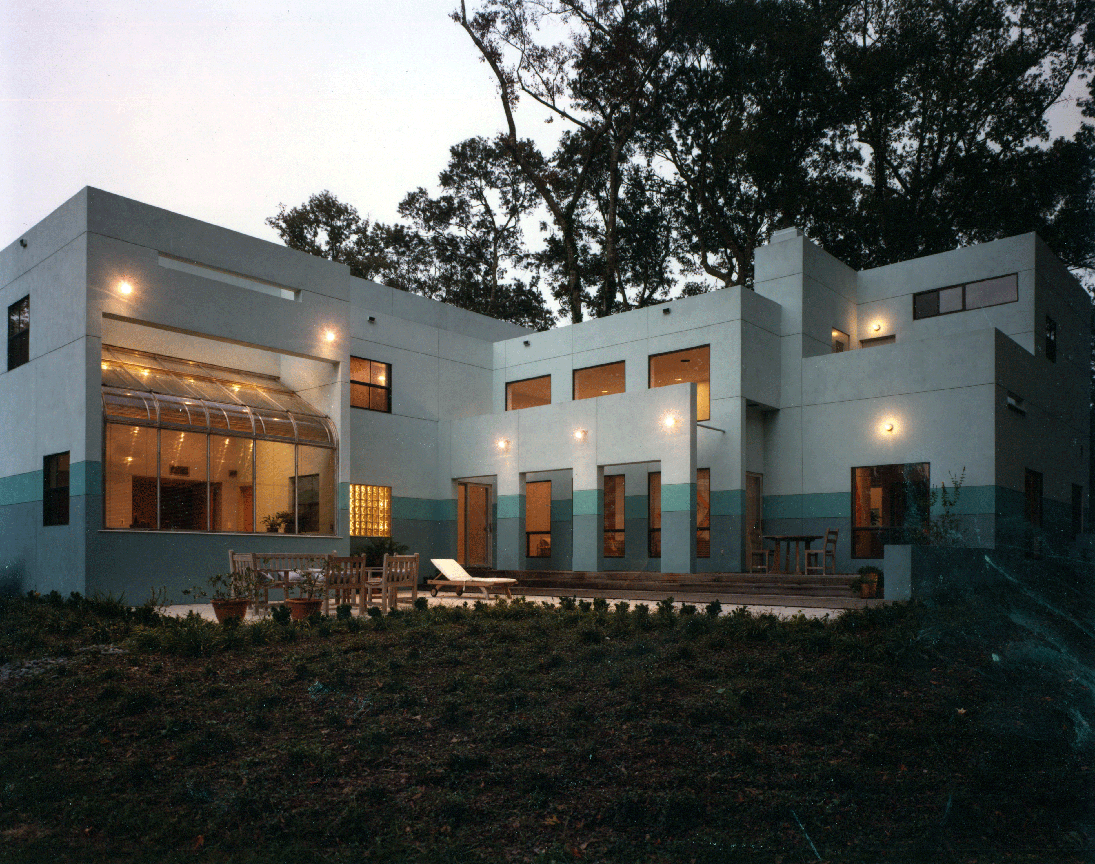
Dusk view, featuring the Sun Room (L) as a greenhouse insert, a glowing 'lantern'
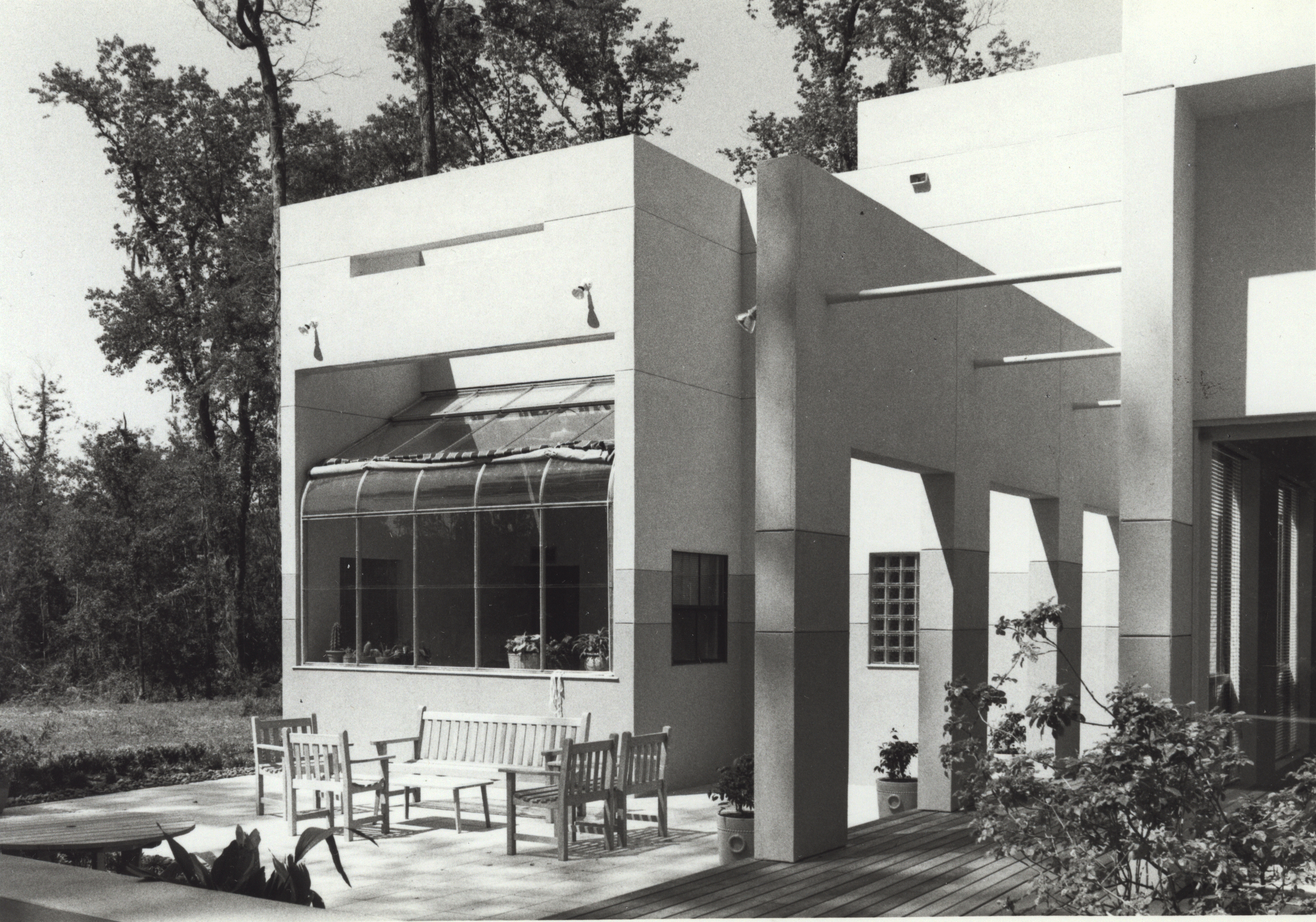
Closeup of the "box" containing the Greenhouse; completion of the Form with the cross-piece spandrel.
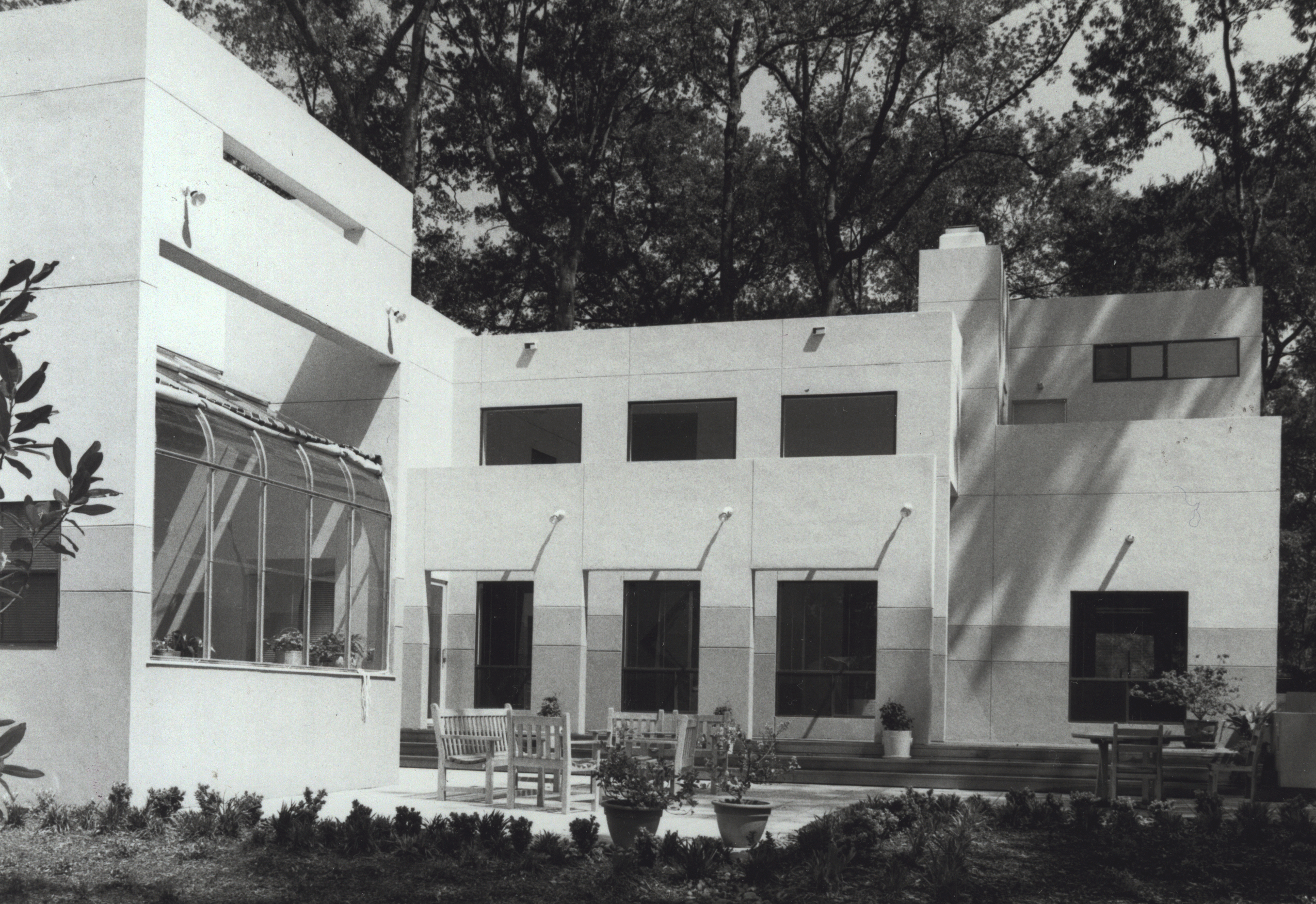
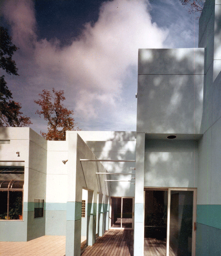
The opposing Forms complete definition of outdoor space.
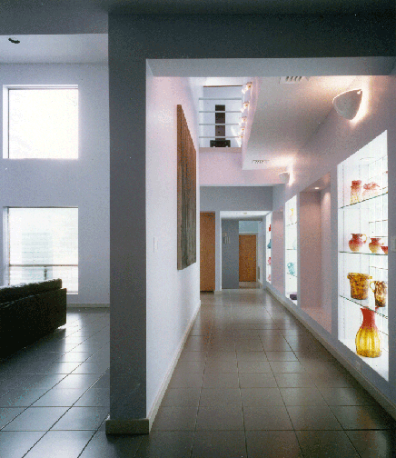
Living Room (L) is separated by the wall plane which is a double-height, its feature being the owner's collection of 19th Century American art glass.
View in opposing direction toward Entry.
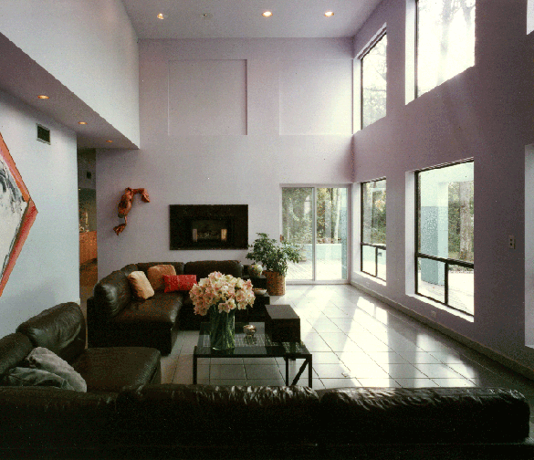
The double-height space illustrates the openness toward the water view. The aperture pattern is echoed in recessed panels and the fireplace. The thicker exterior wall stiffens the wall plane, as well as providing window shade 'slots' as needed. The modular furniture had been purchased before the design, and was organized to orient to view and accommodate art pieces.
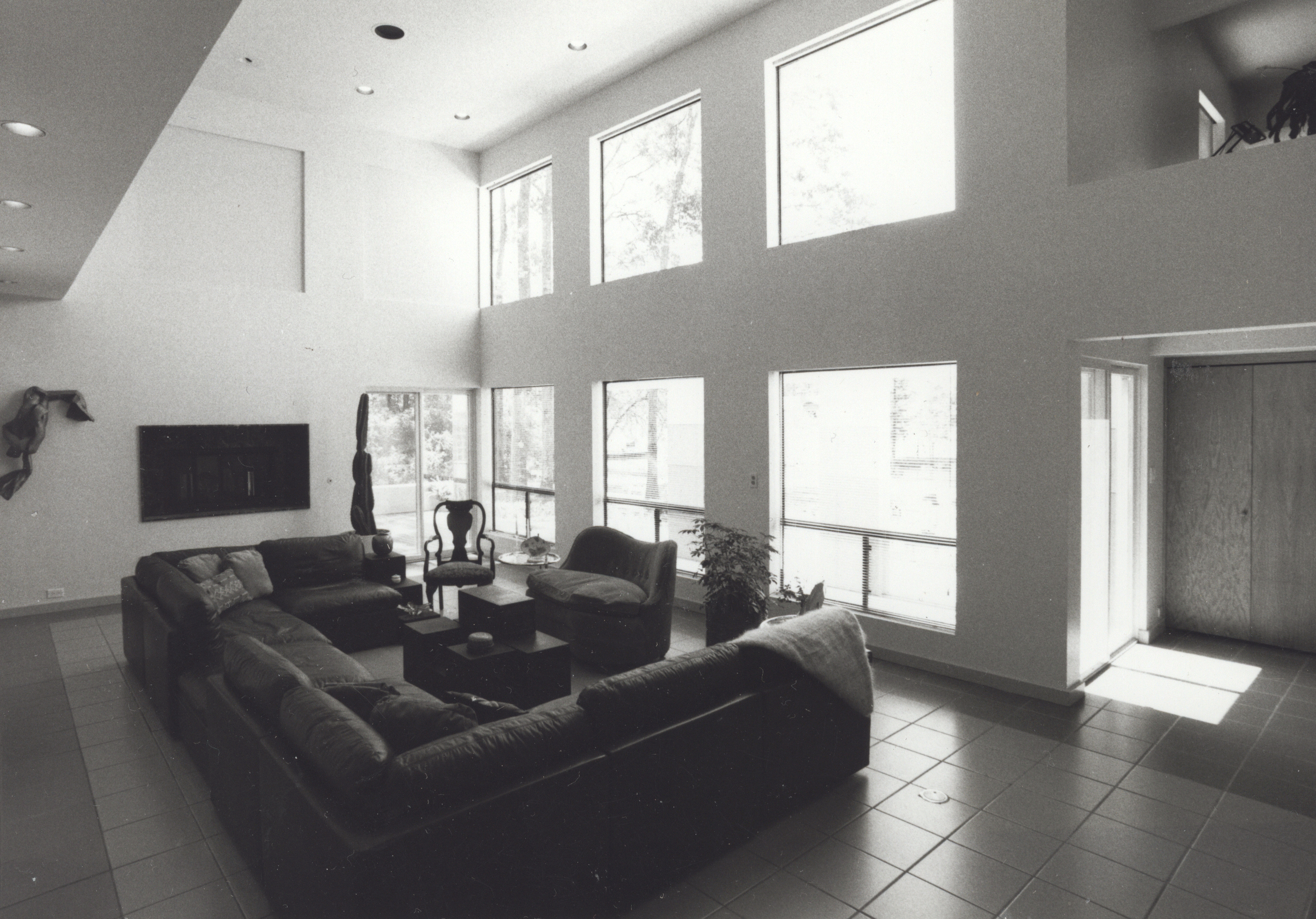
A better sense of interior volume.
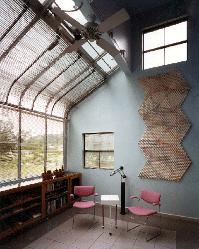
The Sun Room serves as an informal reading space, again oriented to the water view. The greenhouse insert was bracketed by walls, connected by an exterior 'beam', providing shading. In addition, it was an early use of electrically-operated blinds.
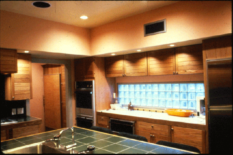
The glass block countertop 'window' faces the approach, and provides a 'privacy' element; it also is set within the green 'banding' of the exterior.
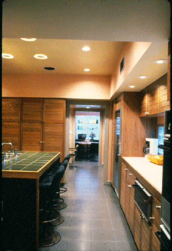
All spaces are spatially connected to others by virtue of 'centered' alignment. In this case, the Kitchen links on axis to a Breakfast Room.
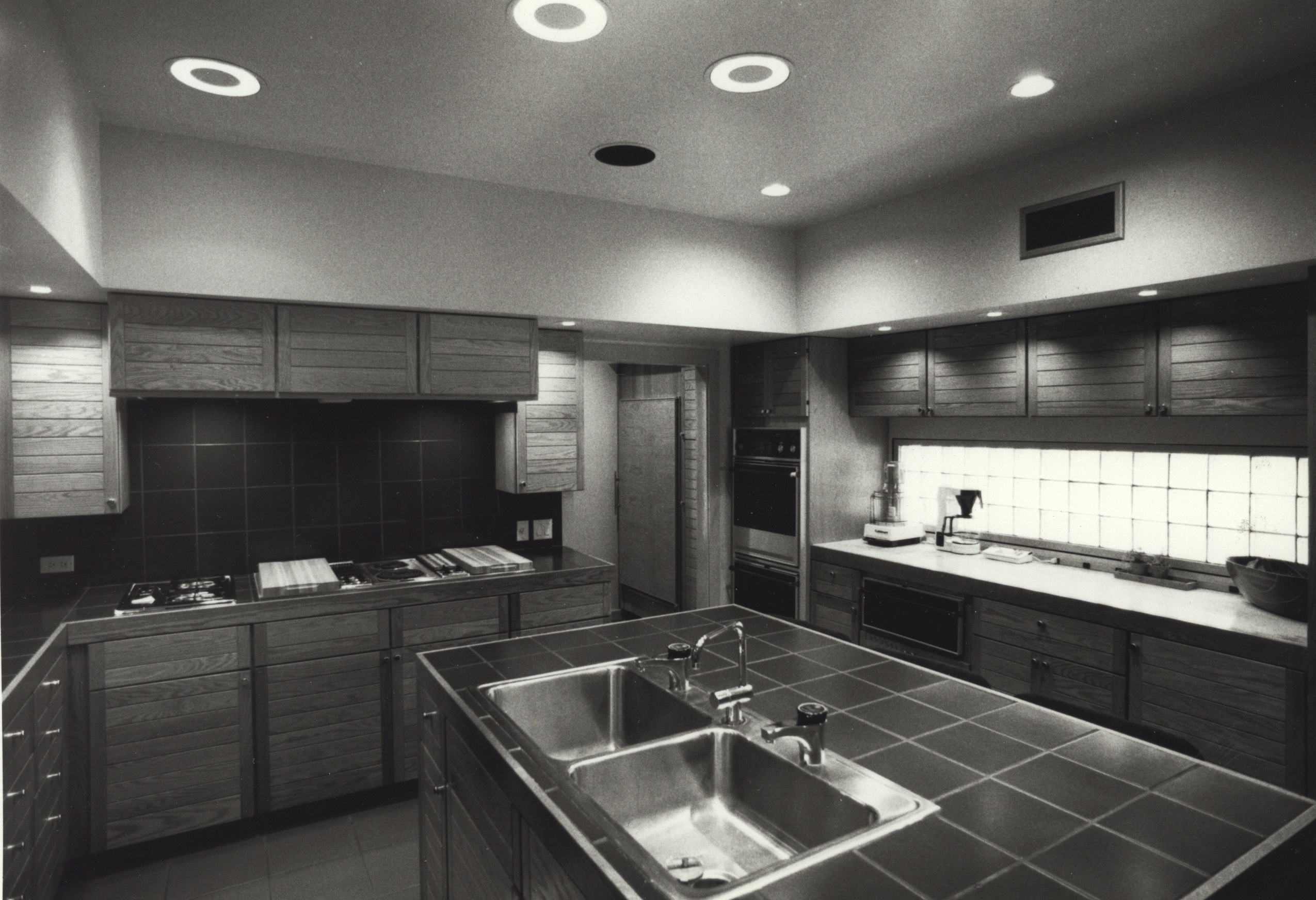
A center of activity for a determined Cook.